
Hi there! You’ve probably landed here because the term 'Accessible Web Guidelines' has been popping up quite a bit. And we get it; the internet can be complex. Collections of jumbles and jargon, a labyrinth of inputs, outputs, and coding that frankly may seem intimidating. But hey! We're here to demystify all of that. We've all been stuck, right? Trying to navigate a site that just doesn't seem to 'get' us? What if, instead, we could shape very every webpage to naturally 'talk' to folks regardless of ability? This is the crux of Web Accessibility- casting a wider net for all users and leveling the digital playing field. Hang on with us as we explore the 'Accessible Web Guidelines,' A one-stop treasure trove morphing the internet into an all-accessible platform. Draconian diction or highfalutin phrases? Not in our book! We'll nix the nonsense and bring you simplicity at its finest. So, what's in it for you? Unlocking digital doors, crafting content with clarity and certainty, and weaving your own web of inclusivity. All set for this adventure? Let’s get started!
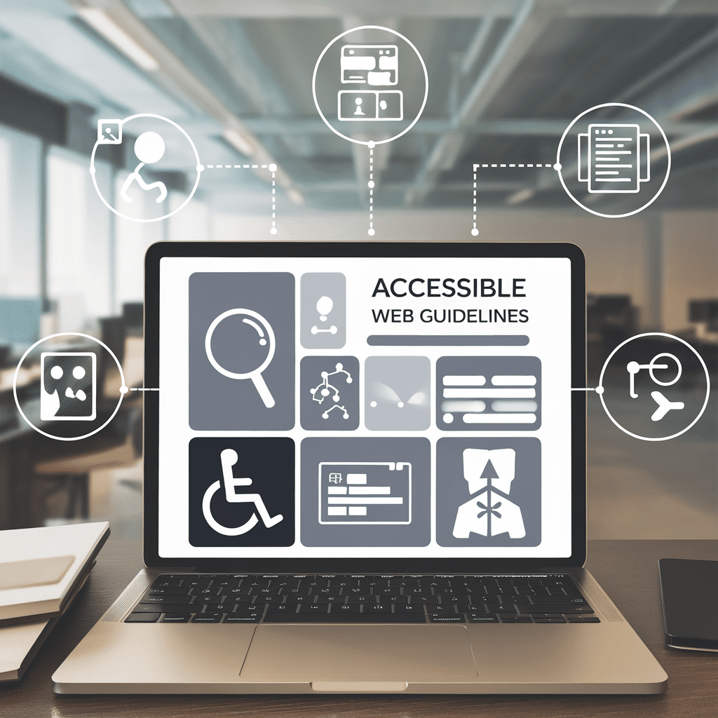
Understanding the Basics of Accessible Web Guidelines
Understanding web accessibility starts with the Web Content Accessibility Guidelines (WCAG). Following these rules ensures your website can be used by everyone. It includes things like adding readable contrast ratios and alt text. Alt text describes images for visually impaired visitors, for instance. So how does one start? The WAI, short for Web Accessibility Initiative, is a good place. This resource teaches you to create accessible content. It’s great for learning about things like ARIA. That’s short for Accessible Rich Internet Applications. Now you might be wondering, what's ARIA? It's a vital part of making complex web features accessible. It gives websites the ability to convey information to assistive technologies. Apart from these, there’s also the subject of accessible PDFs. It may seem obscure, but it’s part of any full accessibility strategy. Finally, don’t forget design. Good, accessible web design is about more than flashy visuals. It's about understanding usability and accessibility. A good design can scale text sizes, read captions on images, or play audio descriptions on videos. The steps may seem overwhelming at first, but remember: community building is a core value in website accessibility. When your website is accessible, it can appeal to all and thus, invite more traffic. So let's continue demystifying accessible web guidelines, one section at a time. And always face any challenge with a problem-solving mindset!
Implementing Equal Access for All Users
Moving forward in our journey to create an accessible web, it's crucial to understand the essence of equal access for all users. Let's demystify the process in the following paragraphs, garnering insights from the authoritative "Accessible Web Guidelines". First things first, an accessible website necessitates purposeful design and thought-out structure. Think of it like a public park. Your website needs to have clear pathways, easy-to-understand directions, and safe, accessible spaces for all visitors to navigate. However, implementing equal access isn't solely about structure. It's also about providing alternate channels. Just like in our park analogy, you may occasionally come across steep stairs or uneven pathways. Not everyone can navigate these paths, right? To alleviate this, ramps and elevators can give individuals the ease of access they need. Similarly, alternative text descriptions for images, captions for videos, and high contrast ratios for content are digital ramps. Perhaps you're wondering about specific tools to achieve this? ARIA (Accessible Rich Internet Applications) lets you create interactive, dynamic content accessible to people with disabilities. Additionally, familiarize yourself with WAI (Web Accessibility Initiative) and WCAG (Web Content Accessibility Guidelines) for comprehensive guides. Remember, taking measures to ensure equal access isn't an added burden. It's an act of community building, a core value we believe in. Weaving inclusivity into our digital fabric isn't too hard, right?
Enhancing Usability Through Accessibility
Welcome back! Continuing our exploration of Accessible Web Guidelines, let's tackle how to boost usability through accessibility for your tech-forward audience. First things first, Alt Text is your new best friend. Think about it—for users with visual impairments, Alt text is their window to visual content. Each image, video, or chart in your content should have Alt text. Stumped on what to write for Alt Text? Describe the image like a friend just did. Next, let's talk colors—you know when you pick an outfit, and your pal says "your colors clash?" It's a bit like that for web design. Remember, maintaining adequate contrast ratio is key to accessibility. Avoid combinations that spell trouble for color-blind users, like red-green or blue-yellow. Instead, go for stark contrasts – black text on white, for example, screams readability! Ever attempted a tricky yoga pose–say, Warrior 3–with a friend guiding you? ARIA – Accessible Rich Internet Applications – works similarly. It enhances web pages making them accessible on assistive devices, like a digital yoga guide for navigating the website. Lastly, commit to accessible Web Design. Follow the 'WCAG'- Web Content Accessibility Guidelines. Imagine WCAG is your guide aiding you across a rickety footbridge over a canyon named 'Inaccessibility.' Heading their advice makes for a smoother journey. The journey may be challenging, and surprises may pop up along the way—but the rewards are incalculable. Not only does this approach make your content enjoyable for all, but it also drives more traffic to your site! A true win-win situation, isn't it? So, are you ready to join the community of web accessibility superheroes?
Maximizing the Power of Alt Text
Building on the insights shared earlier, let's sharpen our focus on how to maximize the power of alt text, a key part of the Accessible Web Guidelines. Like giving a tactile texture to flat images, alt text breathes life into your visual content, ensuring it can be understood and loved by all. You see, alt text, or alternative text is not merely a descriptive text for an image. Instead, it interprets the essence of that image, providing a lavish feast for thought, even when the eyes cannot savor the visual banquet. Just take a moment to imagine an image free web – drab and monotone, isn't it? This is the insipid panorama we save our visually impaired netizens from, by encasing each image within the warm embrace of engaging, incisive alt text. Now, to sprinkle alt text brilliance on our images, start by vividly picturing the content of the image. Find its session-stealing star, its message, and hey, maybe even its mood! Weave these together into a short, crisp sentence for the alt text. Now remember, it’s not about keyword-stuffed descriptions. Instead, it resembles poetry more, capturing the essence of an image. For instance, instead of "two cats," a love-coated "nuzzled kittens in the moonlight" connects better! Say, is there more to your image than snuggly cats? Maybe a standout contrast ratio or an intriguing accessibility design feature? Be sure to mention it in your alt text. It's every bit a part of your image's narrative. By thoughtfully designing alt text, you transform your website into a global stage, breaking barriers of accessibility and usability. By doing so, you adhere to Accessible Web Guidelines and make your website truly yours, sharing it with a wider audience. Together, we are enabling equal access, promoting digital equality, and living the spirit of Community Building! So, throw open those digital doors and welcome a world of accessibility advancements into your web design – starting with compiling compelling alt texts!
Utilizing ARIA for Rich Internet Applications
Piling on from where we left, let's dive deeper into the world of Accessible Rich Internet Applications, or ARIA for short. If you remember our discussion on alternative text, here's something beneficial. ARIA does a similar excellent job making your web page readable. Intriguing, right? For starters, you'll wish to incorporate ARIA tags in your HTML. Consider the images and elements with essential visual data. These eat up a significant contrast ratio chunk. By inputting ARIA's special tags, we let visually impaired individuals appreciate our visual content. Did anyone ask for examples? Predictably, we've got lots spare. Imagine an image capturing a piercing sunset. Applying ARIA, our tag might look like this: `<img aria-label="Sunset over the beach, various hues of red and orange">`. Isn’t this more "accessible" now? Now, remember that too much of anything isn't healthy. Remember our conversation about 'accessible web guidelines?' This situation is a splendid fit. The said guidelines give us a thumb rule. Apply ARIA tags where essential for improving accessibility without overdoing it. Using ARIA encourages equal access via tastefully implemented tags. It unveils our community's visually impaired members the allure of your structure and design. And most importantly, it tells search engines you care about accessibility. Now, isn't that optimal? See you in the world of ARIA!
Ensuring Proper Contrast Ratio for Accessibility
Ever felt frustrated due to barely readable text on a graphically intense site? Well, pursuing accessible web guidelines ensures this won't be an issue. A crucial factor is the correct color contrast ratio, because it greatly improves readability. Have you noticed pages with gray text on a white background? It might be artsy, but it can vex users. This is especially hard for users with visual impairments. Greater color contrast is beneficial for them. Also, a high contrast ratio is great for well-lit spaces or outside use. The rule typically used is 4.5:1. Yep, that's your magic ratio for regular text and images of text. Large text, around 18 point or 14 point bold, should have a minimum contrast ratio of 3:1. For text in an image, ensure alt text is provided, as discussed earlier. Don't fret too much about color theory. Experts have built handy tools for you to check contrast. Like WebAIM's contrast checker. It does the calculation for you. Just input your text and background colors. This nifty tool informs if your combinations meet the WCAG guideline! So let's join the efforts towards building a more accessible web community that values every user. Don't overlook being in line with the accessible web guidelines, because clear text colors make happy web surfers. Hold images and text against similar standards. Together, we got this!
Conclusion
Reaching the end of this valuable trove of information, we are reminded of our initial goal. We began this guide aiming to deep-dive into the enriching world of accessible web guidelines. Haven't we come a long way? From decoding the basic fundamentals to implementing accessibility in web design, we’ve traversed together on an enlightening journey. As we build our technology inclusively, each step becomes a reminder – equal access is not an afterthought, but a right. Whether it’s plugging alt text into our visuals, enhancing usability for all, or refining our contrast ratios, we’re taking solid strides towards a better web. With concepts like ARIA now in our toolkit, bringing richer experiences to our digital communities will be a breeze. Remember, a limitation overcome could mean the world to someone navigating their digital journey. So, let’s gear up, roll up our sleeves, and make our tech spaces comfortably accessible for everyone. So, what are you waiting for? Imbibe these principles, follow these guidelines, and start crafting your accessible web today; one byte at a time! And, with each small step, remember you are aiding in building a digital community that holds true to our core value: ensuring inclusivity for all. Remember: a web available to all is a web better for all. Now, let's get started!

