Welcome, friend! Ever feel like digital terrains can inconveniently turn into a complex maze? Specifically for those experiencing accessibility problems? You're not alone, and here's a comforting fact – this maze can be untangled. Interesting, right? It starts with some really intuitive 'Inclusive Design Tips' that, essentially, hold the lantern that lights up each clouded corner. It's all about overcoming common barriers in tech−allowing equal access, ensuring usability, interpreting alt texts, adjusting contrast ratio, or executing the fine subtleties of a universally accessible PDF.
Having woefully tripped over digital roadblocks one too many times, I've realized the magic that sprouts out from the sandbox of inclusive design concepts, accessibility techniques, and the trusty WCAG guidelines. They are like narrative-ready breadcrumbs for your journey!
So, nestled within this beacon-like guide, we'll translate this seemingly lofty tech lingo into your everyday vernacular. Remember that warm, comforting cup of cocoa on a windy evening? These inclusive design tips will make navigating tech just as comfortable and invigorating.
Yes, the contrast of easy navigation and complex tech concepts can certainly strike discordant notes. However, the essence of this guide reads like well-tuned lyrics; it meshes the said 'contrasts' into a harmonious symphony, where each element compliments another, breaking down jargons and reconstructing them into easy, actionable notes for you, the reader. Welcome aboard on this journey through an illuminated maze − one inclusive design tip at a time.
Understanding Inclusive Design Tips
Continuing our exploration on the path to a more inclusive digital world, let's dive into the heart of what it takes to create user-friendly tech spaces. Believe it or not, you can effortlessly transform your web design into an accessible digital haven for all users, regardless of their capability or technology familiarity. This transformation hinges on simply adopting some inclusive design tips.
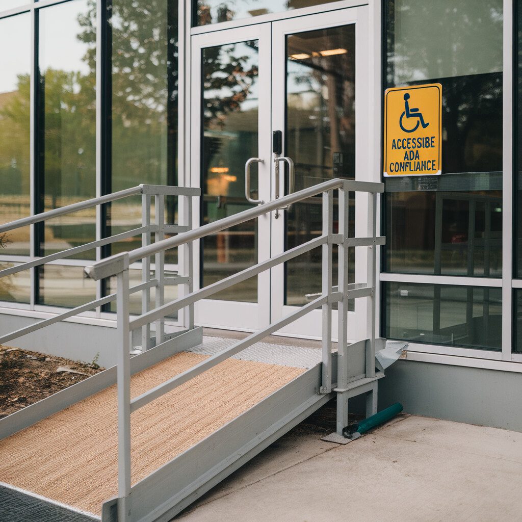
Inclusive design is all about ensuring maximum usability for everyone. Consider these scenarios – A visually impaired user is trying to comprehend your website content through a screen reader, but your images don't have alt text. Or perhaps, a colorblind individual is trying to navigate your website, but your low contrast color scheme leaves them frustrated and disoriented. With inclusive design, these scenarios are avoided, paving way for equality amongst all users.
Beginning this transformative process involves understanding your users' diversity and needs. For instance, implementing alternative text, ensuring contrast ratio, using ARIA for rich internet applications, and designing accessible PDFs.
These are not just some fancy jargon dropped to impress you. They're practical strategies to increasing website traffic. Alt text (Think of it like a helpful guide explaining visual content for screen readers), and the ability to tweak contrast ratio (much like adjusting the brightness of your phone according to light) are all part of making the web experience a smooth sail for one and all.
Don't forget, adhering to Web Content Accessibility Guidelines (WCAG). Think of it as a rulebook offering specific instructions on how you can make your site usable and equal-access. It's just like cultivating a garden – the clearer and more detailed your planting instructions, the better your plants will grow!
So, whether you're creating an Accessible Rich Internet Applications (ARIA), or making a website more accommodating to the needs of a broad audience spectrum, inclusive design is key. Afterall, design which respects everyone's experiences and meets their needs is the only design we should be striving for, isn't it?
In the next sections, we will delve even deeper into these design tips, equipping you with practical step-by-step guidelines, making the world of web a more inclusive place. One design at a time!
Creating Equal Access for All
Expanding on our previous discussion about inclusive design tips, let's delve into the pivotal aspect of creating equal access for everyone. This is an essential part of building an all-encompassing digital community.
Imagine being at a concert, but you're blocked by a giant pillar – frustrating, right? That's how it feels to encounter a digital product or service that hasn't included considerations for accessibility. It's hard to participate when you're constantly facing barriers.
To ensure a smooth concert experience (metaphorically speaking) for everyone, considering designs that resonate with people of all abilities, from those hard of sight to those with motor skill limitations, should be your focus. Accessibility should always be viewed not as a constraint but as an opportunity to innovate and reach a wider audience.
Our journey into inclusive design starts by following WCAG’s principle of “Perceivable.” It is about providing text alternatives for non-text content, like using Alt text for images. This can be achieved through ARIA live regions that help people with screen-readers understand changing context in web applications without user interaction.
In addition, Contrast Ratio can make your text easy to read by visual impairment users. Avoid using color alone to communicate, ensure enough color contrast, and lay out your elements in a way that is predictable.
Think about creating a digital project as like arranging furniture in a room. Everything needs to be within reach, and no one wants to trip over a random ottoman! So, layout your platform to cater to screen-readers and voice assistants, and make sure your PDFs are accessible too.
Remember, we're creating equal access for all – not just a select few. Applying inclusive design tips keeps us honest and ensures we're doing just that.
Next time we'll swap these concert and living room metaphors for some practical examples of how a small detail, such as a contrasting color scheme or thoughtful site layout, can make a world of difference for users of all abilities.
So, stay tuned and keep the energy high. We’re creating better and inclusive digital spaces for everyone! While making a few memories along the way. Curious to know more? Keep an eye out for the next section: Mastering Usability!
Improving Usability Through Inclusive Design
Continuing our exploration into inclusive design, let's really delve into improving usability. Could there possibly be a more splendid field to influence how technology completes tasks? It presents an open opportunity to enhance every user's experience and aids in reducing any accessibility or usability issues.
First, let's imagine a scenario. Ever tried finding your favorite candy in a store, only to discover it's tucked behind other products, infinitely out of sight? Frustrating, right? In the digital realm, intuitive navigation and easy-to-find information on a website can speak volumes for inclusivity, just like clearly arranging candies in a store can enhance the shopper's experience.
Ever-essential usability gains its much-needed spark when paired with well-crafted inclusive design tips. For instance, creating alternative text (alt text), beneficial for visually impaired users, is akin to arranging a light pack for midnight hikers. Both ensure unhindered progress in otherwise challenging environments.
Let's add a touch more flavor to your technology serving. Consider the 'readable' contrast ratio on your website; it should remain akin to a perfectly seasoned dish. Too little, and it ruins the experience, too much, and it becomes hard to digest.
Utilize Accessible Rich Internet Applications (ARIA) and create interactive elements that make your website accessible even to special needs users, much like adding braille translations to public signs.
And then, what about those pesky stacks of PDFs? Convert them into a more accessible format, much like transforming handwritten notes into electronic format. Now each will glow, accessible to all.
Just like how you can share a meal with everyone by being vegetarian (lest anyone is allergic to veggies or petrified by them), designing your website based on the Web Accessibility Initiative(WAI) guidelines or the Web Content Accessibility Guidelines (WCAG) will help improve usability and traffic alike!
Remember, the warmth of community building can amplify when we bake inclusivity into every byte of our technology designs. At the end of the day, we shouldn't just strive to clear obstacles—we should aim to manufacture bridges, enhancing user experience while inviting everyone into our digital haven.
Leveraging Alt Text for Accessibility
Carrying these lessons with us, let's dive right into how alt text can help in making our design more inclusive. First up, what is alt text? It's the written copy that appears in place of an image on a website when the image is not able to be displayed. In essence, alt text is really meant to describe what's happening in a picture, for those who can't see it!
Think about it, have you ever lingered on a blank image, chuckling at some quirk of Internet connections and quirkily worded error messages? Now, imagine if there were no witty lines, and instead, just endless chunks of undecipherable content? Frustrating, isn't it? That's precisely the kind of scenario alt text helps avoid – especially for users relying on screen readers.
So, how can we leverage alt text for inclusive design? To make things practical, let's imagine we have a vibrant image of a bustling spaghetti dinner in our website. Ensuring proper solid alt text like 'A family laughing around a spaghetti dinner.' This feeds both your SEO needs and gives users utilizing screen readers a clear understanding of what's going on in the image.
Remember, writing effective alt text is a balance – we need to provide enough detail without being overly wordy. But more than any a11y initiative or positions on the WCAG, it's about evening the playing field, ensuring every user gets the full experience. Ticking off this little box might not seem like much, but it's just another small leap towards building an inclusive community online.
Blazoning your 'inclusive design tips' on your chest and using right alt tags will not only be a giant leap for your SEO optimization but also a small step towards global digital equality! Surely those are goals worth working towards, aren't they? Definitely many notches worthier than just merely increasing website traffic. Let's get practicing what we preach, and make the internet a welcome place for everyone!
Enhancing User Experience with ARIA
Carrying these lessons with us, let's dive into the world of ARIA or Accessible Rich Internet Applications. Consider ARIA as your eyes guiding you when it gets dark. More than a candle in the wind, ARIA provides ways for interactive elements and information on a webpage to be announced by screen readers. And as part of your inclusive design tips, ARIA is your dedicated guide dog in the digital environment.
Imagine the phone in your pocket. You easily scroll through apps based on sight and intuition. Now, let's say your sight is limited or non-existent, how will you know that button you just pressed is a 'like' button? ARIA's role is crucial here.
Though ARIA attributes can dive significantly into detail, don't worry, we'll start simple. Attributes like 'aria-labelledby' provide a way to override or add to a label already created by an element's native labeling mechanism.
Remember when we discussed Contrast Ratio? Think of ARIA's user-centric technology as a contrast boost, translating visual cues into an understanding kind of silence where interacting with content becomes a breeze.
Moreover, ARIA landmarks like 'banner', 'navigation', or 'main' help orient users with disabilities. They also improve page clarity, just like an easy-to-read map for a tourists in a bustling city.
Using ARIA isn't about adhering to guidelines for their own sake. It’s all about improving that digital journey for everyone, including those who navigate the online space differently.
Leverage your inclusive design strategy with ARIA attributes and landmarks. And who knows? In no time, you might turn your website into an appealing digital home coupled with rainbows of accessible design features.
Remember, in the journey of accessible web design, the ride should be scenic at any speed.
Ensuring Proper Contrast Ratio
Expanding on our previous discussion about inclusive design tips, let's delve into the significance of ensuring a proper contrast ratio. Have you ever squinted at your phone screen because the words aren't vivid enough against the background? It's a common scenario, and frustrating – you know the plight, don't you?
Inclusive design battles this problem with attention to proper contrast ratio. Accessibility is not merely about functioning buttons or understandable navigation, color scheme matters as well. Technology demands our eyes, and nothing screams impolite more than a user interface pushing viewers away because of low contrast between text and background.
Now, consider this like mixing the perfect pancake batter –too much flour, and it's ruined. Just right, and you have the fluffiest pancakes! In the same way, adjusting your color contrast enhances visibility, incorporating 'just right' levels of brightness and hue differences. The importance cannot be understated – after all, a blend of 100 people sees a myriad of different colors.
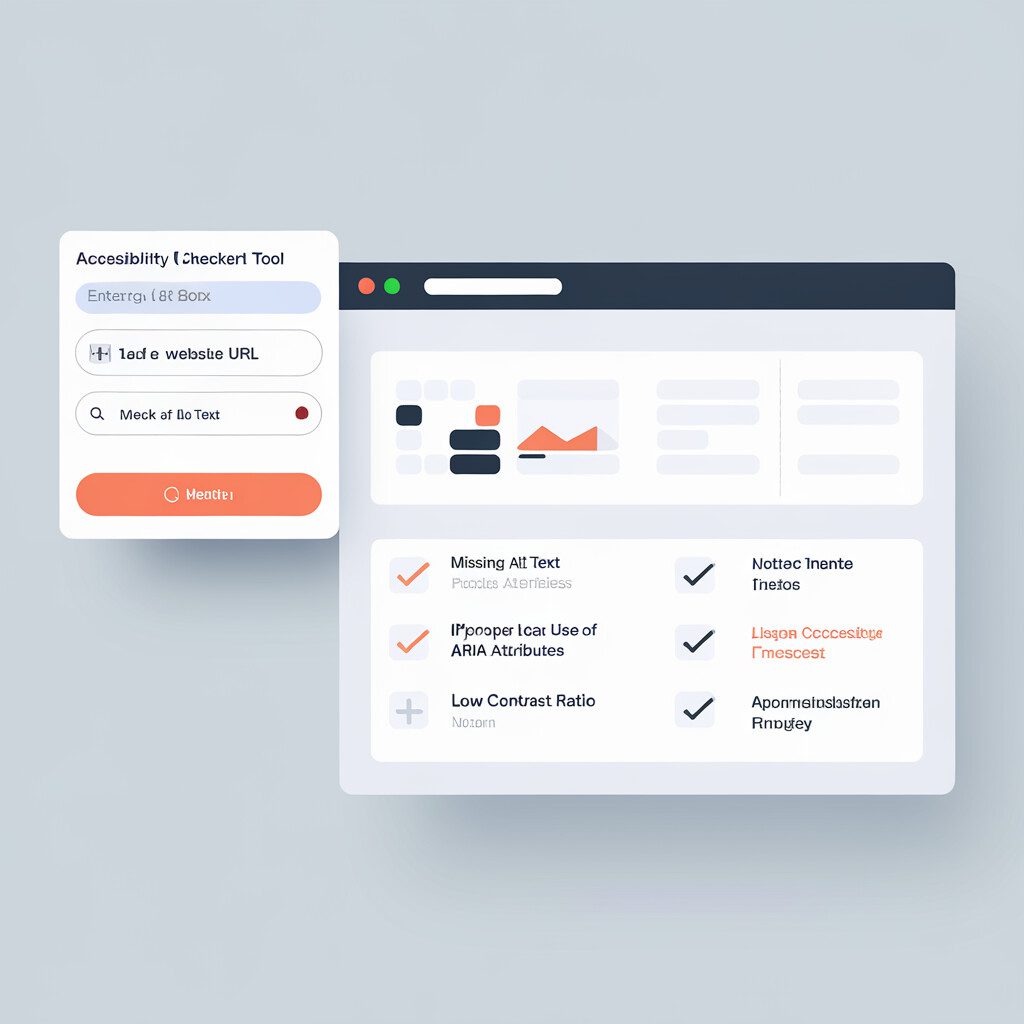
WCAG guidelines suggest a minimum contrast ratio of 4.5:1 for standard text size. Tools like the WAI Contrast Checker can be used to check for these values. Remember our pancake example? Here's a sweet dessert fact: mixing the batter is just the first step!
Our journey into inclusive design tips has only started; hold tight, there are more flavors to savor! For instance, worry not if the concept seems challenging right now; the same way the best pancakes require some trials, devising the optimal contrast ratio might need a handful of efforts, but each one gets better.
Take it as a gentle nudge towards designing with empathy, using proper contrast ratio to enhance the utilitarian function of your interface while ensuring everyone gets an inviting plate of pancakes – or, in our case, a visually pleasing technology moment!
Creating Accessible PDFs
Continuing our journey on these inclusive design tips, have you ever wondered how to make your PDFs accessible for all users, regardless of their abilities? Let's dive into creating an accessible PDF, a crucial step often overlooked by many.
First, when authoring your PDFs, use applications that support accessibility like Adobe Acrobat or Microsoft Word. By using text-based editing applications, it strengthens tech accessibility by allowing your PDF text to be read aloud by screen readers. Say goodbye to pesky inaccessible image-based PDFs!
A handy technique is to structure your content well. Just as an architectural masterplan guides the construction of a sturdy building, headings and styles must be used to lay down the framework for your accessible PDFs. Your H1s, H2s, and H3s will help screen reader users quickly understand your content.
Remember to consider color contrast while designing your PDF. Low contrast hampers readability, and this could be a real challenge for people with visual impairments. Tools like WebAIM’s Color Contrast Checker come handy in checking contrast ratios.
Similar to adding alt text to images on a website, when adding visuals within your PDF, remember to include descriptive alt text can be read by screen readers. It's vital for an effortless reading experience for people with visual impairments.
And last but not least, don't forget to offer those fillable forms in your PDF, make them accessible too. With some clicks in Adobe Acrobat, you can make fields navigable and readable by screen readers.
These inclusive design tips are your golden keys to creating a truly accessible digital environment. Picture in your mind's eye the freedom you're creating for someone who relies on these accessibility practices. Mobility should not be an obstacle to knowledge – let's keep forging ahead, offering equal access for all online visitors. Make it your mission, and always remember: accessible design is good design.
Implementing WCAG Guidelines for Web Accessibility
Moving forward in our journey to achieving a more inclusive web space, let's shift our focus to implementing WCAG (Web Content Accessibility Guidelines).
Suppose you've ever read a recipe and swapped a handful of almonds with a cup of peanut butter in your mother's famous brownie recipe. In that case, you can understand the concept of WCAG. These guidelines suggest tweaking your website to make it digestible for everyone, even with added peanut butter – a.k.a., assistive technologies.
Start with understanding the guidelines thoroughly. Imagine they are your mantra, your web design bible. They give practical guidance on accommodating every Internet user, including those with disabilities. Sounds heavy-duty, huh?
Well, it's not. Here's a spoonful of inclusive design tips. First, make your site perceivable by ensuring that users can identify the information and components easily. Know what this means? Descriptive alternative text folks!
Next, get the site operable. Think tab options for navigation and longer timing for tasks. You wouldn’t want a blink-and-you’ll-miss-it scenario for someone with reduced motor skills, right?
And let's talk about comprehensible. Keeping your content in plain English reaches a wider set of users. Who knew being comprehensible was as easy as a pie… or peanut butter brownie?
Finally, robust. It’s about making just like your mother’s classic dish, shares beautifully and digests well. Design with diverse browsers and assistive tools in mind.
Remember, inclusive design only thrives with observable actions. So, bake that site with care, ensuring a smooth user experience bursting with that “I got this!” WCAG spirit. With a little kneading here and smidge of coding there, you’ll serve a site that truly caters to all.
Wrapping things up, haven't we embarked on quite a journey? We've dug deep into the realm of inclusive design and wrestled with such diverse topics as ARIA, contrast ratios, and WCAG guidelines. I bet you are now convinced – transforming the digital landscape to be more welcoming, accessible, and usable isn't just a one-and-done deal, it's an ongoing commitment.
With each step, from implementing alt text to innovating with accessible PDFs, we've taken a fresh look at what it means to design inclusively. We've chipped away at the boundaries used to hinder our understanding, together creating a profound roadmap, infused with vibrant tips for inclusive design. But remember, it's not about finding the perfect fit right away; it's about nurturing a mindset that values equal access and community building.
Every person deserves to partake and interact effortlessly on the technology landscape. It’s high time we make our contribution towards ensuring this. These inclusive design tips are the strings that tune the melody of equal access, and dear reader, you are the conductor.
Ready to contribute to an accessible world wide web? Go ahead, apply these techniques, tweak them to your unique context or needs, and watch the transformative power of accessible design come alive. I believe in you, my dear friend. It's time to amplify our commitment to inclusive design. How about it? Let's start today! After all, making the world accessible is just a click away!