Hey there! First off, cheers to your curiosity about the world of "UI Contrast Ratio." I know the whole jargon can feel like a jumbled mess of tech lingo – been there, done that. But fret not, you're about to break it down, demystify it, and make it your secret ally. Ever found yourself squinting at a screen, struggling to decipher cryptic, low-contrast text? If yes, you understand the importance of good UI design and, more particularly, the pivotal role of UI Contrast Ratio. Without intimidating math, this guide will help you grasp ‘How to Calculate UI Contrast Ratio,' among other cool stuff. You'd be amazed at how shifting the balance between text and background colors can uplift usability and make a world of difference to your web accessibility. Did that just feel like a newbie designer's dream just got spoken into existence? Oh, yes, it did! But that's just the tip of the iceberg. This practical guide will handhold you on the path to reinforcing UI Contrast for better accessibility, showcasing helpful tools that can aid you in the journey. We'll also give you tips on running tests and maintaining continuous improvement. One more thing before we dive in: remember, you're not just boosting usability – you're promoting inclusivity. It’s not just about technicalities, it’s about making the web a welcoming place for all. The tech community cherishes innovators! Now, let's buckle up, and turn you into one.
Understanding UI Contrast Ratio
Imagine reading a book under dim lighting. Ever noticed how it strains your eyes? Poor contrast between text and background results in the same discomfort online. A high contrast ratio ensures our text is distinct from the background. This eases reading and satisfies WCAG guidelines. Ideal contrast ratio? 4.5:1 for normal text, and 3:1 for larger, bold text. How to get this right, you ask? Glad you asked! Accessibility tools, such as the Chrome DevTools contrast ratio checker, extend a helping hand here. Simply select the text or graphics, and reveal their contrast ratio. Pro Tip – review your ratio under different light conditions. The sun’s glare or dark rooms can drastically change perception. In the mission of crafting accessible UIs, understanding contrast ratio is your trusty first step. Armed with this knowledge, you're ready to welcome a diversity of users into your web world! Always remember, in the realm of web design, great contrast is akin to reading in perfect light. Isn't that comforting?
Importance of Accessibility in UI Design
Expanding our previous discussion on interface design, let's touch on the critical aspect of UI Contrast Ratio. Have you ever used an app or website and noticed the text just blends into the background? It's not a great experience, right? That's where magnifying the 'UI Contrast Ratio' rescues your design lifeboat from sinking in a sea of fuzzy. Imagine this scenario: community members cannot use your website because of contorting text, imagery, and backgrounds resulting in a monotonous blend. These obstacles degrade the user experience (like a summer scoop of vanilla ice cream melting on hot cement!). The essence here is to commit commandments of accessible designs to memory, including that centralized term – UI Contrast Ratio. This term is not so perplexing as it may sound. It refers to the stark disparity between two colors in your User Interface. Multiplied proportions of light versus dark elements make your site more appealing and extra accessible. Greater the Contrast Ratio, better the accessibility – simple as that! Why, though? It's pivotal for people with visual impairments or color-blindness primarily. Enhancing your UI Contrast Ratio is an essential accessibility commandment – not to be ignored. It earns a thumbs-up sign from WCAG (Web Content Accessibility Guidelines), contributing to better, easier to navigate digital products. Stay tuned because the next section deals with accomplishing this. Ready to paint your design canvas with shades of inclusion? Yes, you are!
How to Calculate UI Contrast Ratio
Carrying these lessons with us, let's explore how we can calculate UI contrast ratios. The process is simple but surely requires attention. First off, you need to determine the colors of your user interface elements. Use a color picker tool for this. They’re handy and available online. Next, you locate the RGB (Red, Green, Blue) values of your chosen colors. Most color picker tools provide this info. They look something like this RGB(0,0,0). These numbers represent the intensity of red, gamma, and blue on a scale of 0-255. Then comes the fun part, transforming RGB values into contrast ratio. This, however, gets a little mathematical, yet really interesting. Think of it this way, making a complex doughnut. You need to plug your RGB values into a luminance formula (The maker of your sweet delicacy). When done accurately, it spits out brightness levels that bring your doughnut to life. Similarly, the formula does that for each color. Then just divide the brighter color's luminance by the darker one's. The result called a contrast ratio, tells your viewer's eyes if your UI is a well-baked doughnut or a weak one. Don't worry about the math. Online contrast ratio calculators are available. Just input your RGB values and voila!. UI Contrast Ratio – sorted! Remember our goal – increasing traffic? Making your website accessible by considering contrast ratios does exactly that. Surely, the art of mastering UI Contrast Ratio is one reachable mountain. Shall we forge ahead, folks? Your UI's potential contrast ratio awaits.
Implementing UI Contrast Ratio Guidelines
Carrying the lessons learned, let’s dive deep into how we can smoothly implement UI contrast ratio guidelines for your technology website. It can seem overwhelming at first, but hey, similar to cooking your favourite meal, after a few trials, you got this! First off, gather your 'ingredients'. In this context, that means doing a website audit and identifying elements like text, images, and graphics that need improved contrast. It’s like rummaging through your kitchen cabinet before cooking, eh? Right next, grab some useful tools like online contrast checkers and switch things up. Much like adjusting the salt in a recipe, you can play around with light against dark, colour against colour, until you've found your perfect mix. Always remember, aim to achieve at least a 4.5:1 UI contrast ratio. This will suit the guidelines set by WCAG and provide for a well-seasoned dish! Now, hold on a sec! Just increasing the ratio won't be enough. You've also got to consider text size and font weight. Let’s picture it as using different pot sizes in cooking – a larger pot (a.k.a. larger text) needs less heat (contrast), and a smaller one needs more. Vary your content according to its 'size,' and see delicious results. Trail this with an on-the-go test drive involving real users navigating your modified website. Relate to tasting your dish for another layer of assurance? Lastly, don’t forget to use ARIA labels—the secret spice to providing essential context to your contrast changes. Just like Curry being incomplete without salt, nothing in usability gets done without involving community inputs. Set up a feedback system to keep updating the tweaks. It is iterative, dynamic, and ultimately leads to a delight for your tech-savvy community! Like that, voila! You've jazzed up your website and implemented the UI contrast ratio guidelines, just like a pro-chef! Now, are you ready to serve up the incredible work that you've created? Let’s affirm together, your website traffic is soon going to see a rip-roaring surge!
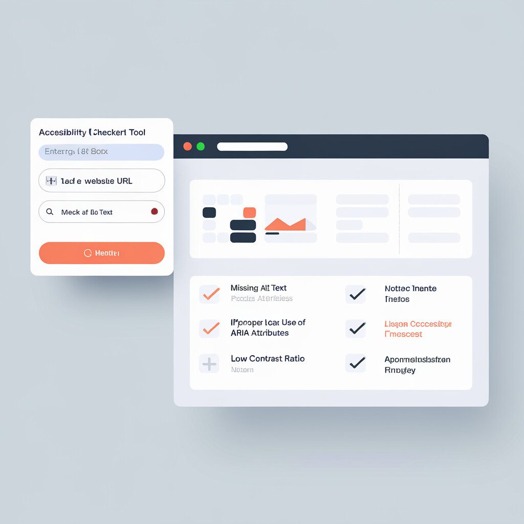
Testing UI Contrast Ratio
Ever felt overwhelmed by the technical jargon when trying to fully grasp UI contrast ratio testing? You're not alone. So, let’s break it down. Imagine you're in a dimly lit room, trying to read a book with light-grey text. Frustrating, right? That illustrates the need to test the UI contrast ratio in web design. The process is straightforward. Your journey might start with an online contrast checker like WebAIM. Plug in the colors you're using in your design, and boom! The checker tells you your contrast ratio. Ratios above 4.5:1 generally mean good contrast. But if the tool says "Fail", your contrast could use some improvement. No worries, though. That's just an opportunity for polishing. Next, consider using a tool like Contrast-Finder. It suggests alternative colors to improve your ratio without far detouring from your original palette. It's like having a friend guiding you to the perfect color mix. Lastly, think beyond color. Ponder your fonts, shadows, and other design elements. Do they add clarity or confusion? Is text easily readable, both in broad daylight and a dim location? After all, a well-contrasted site leads to better readability and improved accessibility for all. And there you have it – you are creating inclusive and accessible designs like a pro! Good on you! Keep using these tips, and your website traffic is bound to increase. Isn't functionality amalgamated with inclusivity a wonderful thing?
Tools for Monitoring UI Contrast Ratio
Walking into the wonderful 'toolshed' of web accessibility, let's meet some friends who can lend a hand in keeping an eye on UI contrast ratio. Don't worry, they're user-friendly! Kick start the experience with a simple yet powerful aid, the WebAIM Color Contrast Checker. With this jester, you can pick any two colors and 'Voila' – it tells you their contrast ratio. Plus, it also lets you know if you meet the WCAG guidelines. It’s like a magic 8 ball for UI contrast ratios! If you're wanting more power, say hello to Contrast app. This superman doesn’t just gauge the contrast ratio, but goes the extra mile to check real-time contrast ratio as you're using your software. How's that for a neat superpower? Ever heard the phrase "there's a chrome extension for that?" True to form, the ColorZilla extension steps up as a hunter. Hover over any spot on a page with its Eyedropper tool. ColorZilla instantly shows your desired information. It quite literally acts like a magnifying glass detective on a thrilling case! Despite their varied flavors, these tools all rally around the same cause: improving “UI contrast ratio” and overall web accessibility. All you have to? Grab their metaphorical hands and welcome them onto your 'tool' team! With their help, the once-dauting contrast ratio issues become a breezy walk in the proverbial park. Who would have thought tech could feel so cozy!
Continuous Improvement for Accessibility
Carrying these lessons with us, let's delve deeper into accessibility optimization. Remember the UI contrast ratio? Well, it's key to continuous improvement. High UI contrast ratios make websites more user-friendly for everyone, not just visually impaired people. Just picture this: You're reading a website in bright sunlight. A high contrast ratio will make it easier, giving you a more pleasant experience. That's a more accessible website, right there! But don't ever make one-off changes and wash your hands off the responsibility. Think of it like gardening. Sure, you plant a tree—but does it stop there? Of course not! You need to water it, prune it, nurture it over time. It's the same with website accessibility. Post adjustments (like fixing that UI contrast ratio!), auditing becomes crucial. Regularly check your site for arising accessibility or usability issues. Tools can help here, flagging potential problems. Then, it's up to you to fix them. Prioritize these audits—schedule them into your team's workflow. Sounds overwhelming? Don't worry! Remember that small, consistent steps can make a big difference. Rise to the challenge. Embrace the process. See it as an opportunity to build your community, rather than as a chore. When your users notice how accessible—and continuously improving—your site is, they'll stick around. And what's more satisfying than that?
Conclusion
As we wrap up, it's evident that understanding the UI contrast ratio isn't rocket science. It’s a simple concept with HUGE potential. This guide has walked you through every facet of it. Our chat on accessibility in UI design has underscored its massive significance. Moreover, the instructions offered easy-peasy methods to calculate and test the UI contrast ratio. Remember, though, the crux of our convivial exchange isn't merely technical know-how. It leaps beyond, into action, into building, and into making our digital spaces accessible for everyone. Isn’t that an inspiring goal? Ensuring designs resonate with all users isn’t just a courtesy; it’s a responsibility. And it starts with you. Let’s conceive every design through the lens of accessibility. Today! Take the insights from this guide and start weaving them into your projects. The power to make the web accessible to every single human lies in your hands. Embrace it. So, why wait? Fire up your favorite design tool and start exploring the wonders of impeccable UI contrast ratios! Let your work reflect your commitment to accessible web design. "Heartening progress takes time. Onward, my friend!" We can’t wait to see the amazing things you’ll accomplish! Let's continue to make the web a more inclusive space – together.