Welcome to your one-stop shop for all things "Tech Accessibility Law"! We get it – grappling with accessibility and usability concerns in the tech world can feel like sailing in uncharted waters. But don't fret. We've carefully prepared this comprehensive guide to lend a helping hand on this eye-opening journey. In the ever-growing, tech-savvy world, ensuring equal access for everyone remains both a life-context challenge and a worthy cause. Sometimes, the sea of legal jargon and the myriad of guidelines around the topic can make it seem intimidating. We've gasped for air in that same sea, so we totally get you! By tackling this guide, you're setting sail towards a broader understanding of tech laws intended to improve usability. From the significance of Alt Text, guidance on using ARIA for accessible web applications, to crafting accessible PDFs – we have your back. Through all the 'who's, 'what's, 'when's, and 'why's, one thing’s for sure: you’ll glean insights on making technological platforms more inclusive and compliant. We packed this tour guide with real-world applications, insider tips, and even fun facts related to our core values. Ready to dive into the universe of tech accessibility? We promise it's an enlightening trip. Let’s gear up, fellow voyager! You're bound for amazing sights.
Understanding the Basics of Tech Accessibility Law
Understanding tech accessibility law might seem overwhelming initially. However, diving into our core topic “Tech Accessibility Law” doesn't have to be a chore. Let's start with an analogy. Assume a city, unable to be navigated by everyone due to the absence of ramps or auditory walking signals. Pretty difficult situation, right? Now, compare that with a website not optimized for accessibility; for some, it's just the same kind of barrier. Equal access is the cornerstone of all technology law. In this light, why not consider web accessibility just like other civil rights laws, promoting equal access to digital spaces? Shift your perspective and things simplify. Remember the mentioned analogy and then think about items like alt text for images, contrast ratio for color-blind users, or ARIA landmarks for assistive technology users. All are designed to ensure everyone can engage effectively with digital content. No knowledge quest is complete without real-world examples. Consider Accessible PDFs. Remember those school textbooks that we all loved so much? Well, if those were only image files, a visually impaired friend of ours couldn't read them. Accessible PDFs are the solution for this, they make the digital text readable by screen-readers, ensuring universally readable content. Bearing these examples in mind, step confidently into the world of tech accessibility law with a clear vision – building an inclusive, digital community accessible to all. Just as building a ramp opens a store to wheelchair users, embracing tech accessibility laws will open digital doors for all users, regardless of their abilities.
Navigating Equal Access Requirements
As we move along our journey of achieving tech accessibility, let's talk about equal access requirements. It may seem like a maze, but fret not – it's just about ensuring that the digital world is welcoming to all users. Ever come across a document you couldn’t read because of color? It's frustrating, right? That's where understanding contrast ratio comes in. Text should stand out distinctly against a background, making it legible for all. This is especially crucial in accessible web design, where it can seem like an artful balancing act. Now, imagine being unable to use a website due to limited alternative text or ARIA landmarks. Frustrating, isn't it? Going a step further means ensuring elements like Alternative Text (alt text) or ARIA are well-executed. Alt text helps screen reading softwares relay an accurate description. ARIA landmarks, on the other hand, help navigate the website smoothly, indicating what each section contains. Just stumbled upon a PDF and it won't read out loud properly? This fate can quickly be remedied with accessible PDFs. Simply put, they're PDFs that anyone, regardless of their abilities, can understand and follow. Move ahead on these lines, familiarizing yourself with the relevant tech accessibility laws. They spell out the bare minimum, but feel free to exceed expectations. Sprinkle in some love and respect for all humans, and you’ll do just fine! Like cookies, accessibility laws are better when home-baked with the goodness of community values. Following them sets you on track and helps build a technology available all. The magic keywords? Tech accessibility law!
Implementing Usability Best Practices
Just like we learned earlier, following the 'Tech Accessibility Law' makes your site user-friendly. So, let's dig a bit deeper into usability best practices. Imagine you're visiting a new city. While you're excited about exploring the city, you wouldn't know where to go without direction signs, would you? Similarly, your website visitors need guidance. Make your website easy to navigate with visible and understandable menus, buttons, and links. Look at how your content appears on the page. For instance, how would henpecked paragraphs help you read an exciting novel? Not at all, right? To assure your content is digestible, break it down into chunks. You'd be surprised how affecting MM's – margins and modulations – really are. Also, remember color contrast ratio. Too little makes your text fistfight the background, tiring your visitors' eyes. Whereas, too much gives it a pesky, attention-craving disposition. A harmonious contrast ratio is key. You should also make sure links are conspicuous – undercover agents don't bode well here. Providing underlined or colored links improves usability. What about when your users can't see or understand the images? Alternative text or "alt text" comes into play here. It describes the image for those using screen readers, or when the image doesn't load. By leveraging accessible design and 'Tech Accessibility Law', you stand out in the sea of web content, building deeper connections with your site visitors. Remember, making your site accessible isn't just lawful; it's also undeniably delightful. Guess implementing these usability best practices doesn't sound as scary now, does it?
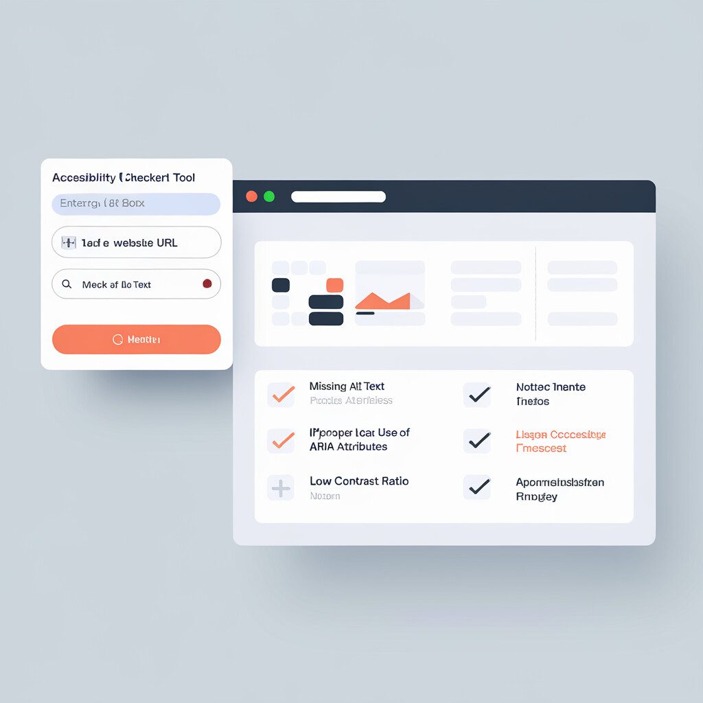
Importance of Alt Text (Alternative Text)
Let's dig deeper into our digital journey by understanding Alt Text. You know when you try to view an image but, unfortunately, it won't load. You're met instead with a short descriptive text? Ta-da! That's the magical Alt Text! Under the Tech Accessibility Law, it plays quite the hero in our accessibility story. Here's the scoop. Alt Text (also known as alternative text), provides a textual description of images. It aids individuals with visual impairments who use screen readers. It's like you're painting a picture with words for them. Pretty cool, right? How do you create it, you wonder? Well, it's simpler than you'd think. While inserting an image onto a webpage, look for a field labeled as Alt Text, Alternative Text, or sometimes Alt Tag. Here, write a concise, accurate, and useful description of the image content. Props to you, you just made your website more accessible! Let's talk scenarios. Imagine a website with infographics about Tech Accessibility Law. Without helpful Alt Text, the valuable information remains: guess what, inaccessible! Now, that defeats the entire purpose, doesn't it? Remember, the ultimate goal is not just more traffic, but the creation of an inclusive digital community where everyone belongs. So, take the Alt Text route and help someone experience the web fully. Because, the Internet without accessibility? That's like a breakfast without coffee: tragically incomplete!
Leveraging ARIA for Accessible Web Applications
Continuing our exploration on tech accessibility law, turn your attention to ARIA. ARIA (Accessible Rich Internet Applications) is your accessibility best friend. This set of attributes helps make web applications more accessible to individuals facing dilemmas with accessibility or usability. So, how can we make the most out of ARIA while designing accessible web applications? ARIA uses different roles and properties, acting as an assistive tool. The process may seem daunting, but they're your secret weapon for accessible design. Picture an online form that needs to be filled out. Without ARIA, users with a screen reader may find the required information hard to discern. Bam! You bring ARIA into the game. Now, each part of the form clearly communicates its purpose. Users no longer have to stress about confusion or misinterpretation. Fun fact: ARIA has around 70 roles! Imagine those as different costumes your website can wear to fit every visitor's needs. And before you ask, yes, one size fits it all! With the tech accessibility law on your side, players, dialogues, search boxes, or navigation are now welcome at the accessible web design party. Spreading the knowledge of 'Tech Accessibility Law' adds another brick to the foundation of our community building efforts. Let's continue livening up the web, one ARIA tag at a time. It's a small step, but the outcome? Huge! Remember, a little change can spark a wave. Now, shall we move into the next phase?
Ensuring Compliance with Contrast Ratio Guidelines
Moving forward in our journey of understanding the Tech Accessibility Law, let's explore contrast ratio guidelines. It may sound technical, but hang in there; we'll break it down! A high contrast ratio makes website text more accessible and readable, and it's a major tenet of accessible web design. Start by picking a color for the text and its background. You must be thinking, 'That's pretty straightforward, isn't it?' Well, it's not just about aesthetics. There are rules to follow to ensure usability. Remember, the goal here is to cater to all visitor needs, including those with vision impairments. For instance, for regular-sized text, aim for a minimum contrast ratio of 4.5:1. And let me help you visualize – ever struggled to read a pale yellow text on a white background? That's due to a low contrast ratio. What about large text, you ask? Aim for a ratio of 3:1. Check this through dedicated tools available online. Pop in your chosen colors, and it'll crunch the numbers for you. Easy-peasy, right? Keeping in view the Tech Accessibility Law again, don't dismiss color blindness. Ensure your design works with common forms of color blindness. Before publishing, test thoroughly. Remember, usability is a journey in itself. So, celebrate every step toward accessible tech spaces. You're making this corner of the internet more welcoming every day!
Creating Accessible PDFs for All Users
Moving forward in our journey to make technology accessible, let's delve into creating accessible PDFs. PDFs can pose immense challenges for people with disabilities. Enter the tech accessibility law which champions inclusivity in all digital affairs. The first step to create a more accessible PDF starts at your document creation source. Microsoft Word and Adobe InDesign often make this easy. Use their "Accessibility Checker" to identify areas of your documents that could become problems. These tools pinpoint weak spots like missing alt text, lack of a content order, or low contrast ratio. Remember everyone's favorite childhood game, 'connect the dots'? Think of it as the logic followed for creating tags. Tags provide a structured, textual representation of the document’s content and aid movement. They underpin successful navigation by screen readers, fitting rightly within the tech accessibility law, enhancing usability and making your PDF statistically more engaging. Using headings correctly is as essential as choosing the right pair of shoes. It gives structure and an easy-to-follow order. Make sure to provide alternative text (Alt text) for images. It's the text equivalent of a roadmap, providing a clear path for individuals using assistive technology. Summing up, accessibility isn't only about compliance but about considerate, forward-thinking design. Making your PDFs friendly and accessible paves the way for an inclusive digital environment, a goal the tech accessibility law aims to accomplish.
Conclusion
In wrapping up, we've unravelled the vast tapestry of Tech Accessibility Law. It's deep and wide, yet don't feel daunted. Arm yourself with knowledge, the weapon of choice against inaccessibility. Dwell on the core components, from alt text to ARIA. You've got this. Consider it a challenge. One where you uplift an entire community while working to improve web usability. Every element, every contrast ratio, is stepping stones to accessibility. With the right approach, even tackling accessible PDFs becomes achievable. The best part? You have the power to spark positive change. Yes, elevating web design may have its ups and downs. But let's face it, what worthwhile journey doesn't? Whether you're a seasoned tech wiz or a novice, every step toward better accessibility matters. In the grand scheme, building a better digital world brings us closer. Upholding accessibility bridges the gap. Your steps today pave pathways toward an inclusive web environment. Together we have the grit to rise and the will to weather this storm. So, leap into action, dive into improvement, pull up a chair, and make your mark. Start expanding your understanding today. Step forward to build a tech world rooted in accessibility. Let's create a world where legibility means liberty. Here, on the brink of change, stand tall. After all, creating a friendlier digital world starts with you. Ready, set, let's transform!