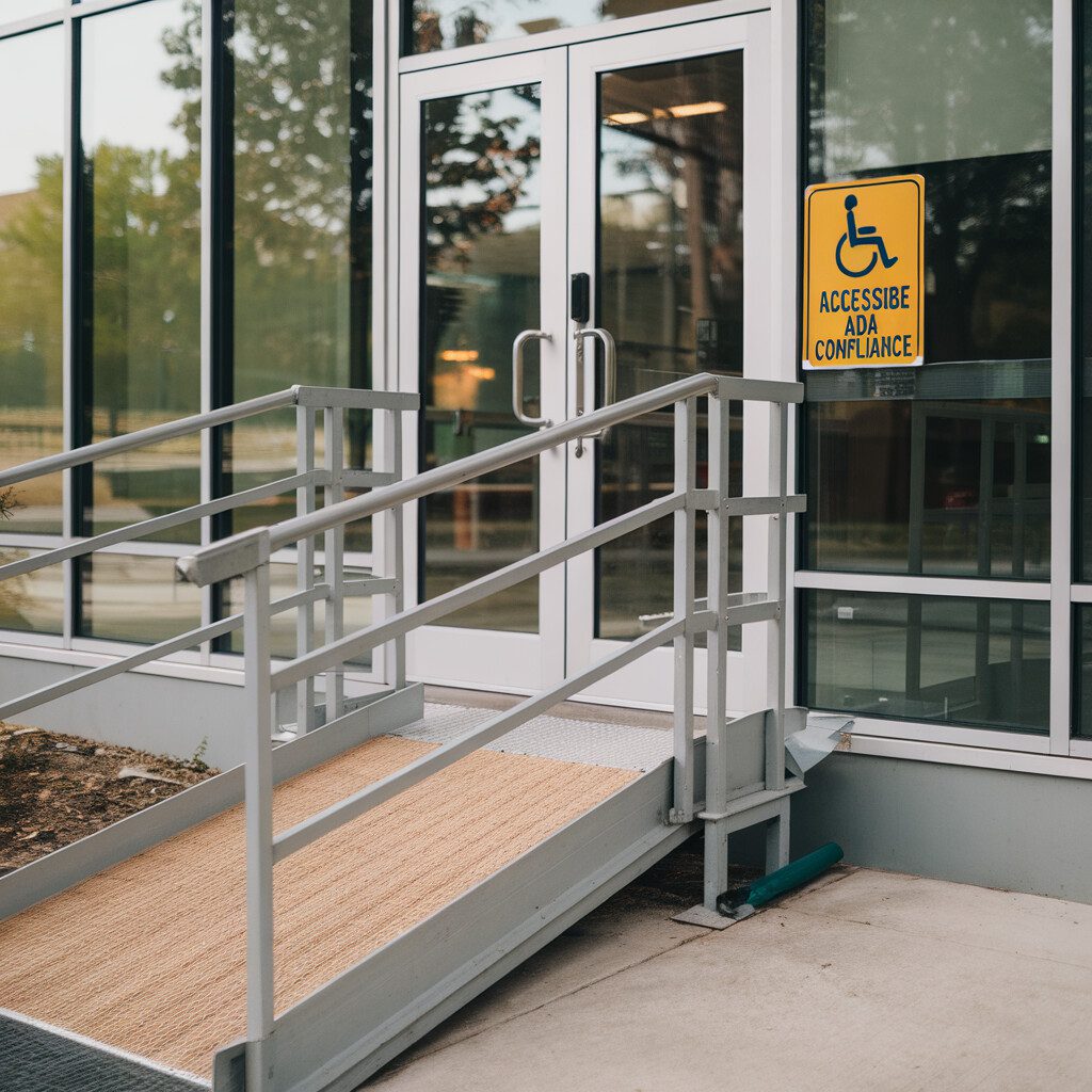
Welcome to the mysterious, yet vitally important world of the Internet, where not all heroes wear capes. Ever tried Googling something with your eyes closed? How well did that go? Would you believe me if I told you that billions of people are doing it right now? Well, they aren't shutting their eyes, but still dealing with challenges that make internet usage trickier than breaking into Fort Knox. You've stumbled upon our inclusive guide, your new best friend, to help you in the adventure of creating more accessible web experiences.
Let's dive together into the ocean of "Accessible Web Tips," silhouetting necessary checkpoints along the way. We're setting out in search of the keys to unlock the doors of the Internet's treasure chest of information—all users should have a damn good map, right? Understanding accessibility, crafting perfect alt texts, ensuring a desirable contrast ratio—note them down as your shine-in-the-dark tools.
Maybe you've struggled with questions like, "What the heck is ARIA, and why does it sound like my next-door neighbor?" or "How can I ensure equal web access without a starring role in a coding nightmare?" Don't worry, we've all been there. No jargon, no gibberish—just practical, easy-to-understand hints and tips at your service! Ready to create a Web that can sing along with each and every user? Let's dive in, shall we? Accessibility, here we come!
Welcome to our guide on "Accessible Web Tips," designed for anyone eager to enhance web usability for all users. In this article, we’ll explore key themes such as the importance of crafting effective alt texts and ensuring appropriate contrast ratios. Therefore, whether you're asking about ARIA or looking to improve overall access, we provide straightforward, practical advice to make the web a more inclusive space for everyone. Let’s get started on this accessibility adventure!
Understanding Accessibility: Key Concepts and Importance
Ever had an obstacle come between you and your favorite website, like too small text or awkward color contrast? Imagine what if it was more than just an occasional snag – for many, navigating the web isn't a loyalty test, it's an everyday struggle.
In defining "web accessibility," think of it as democracy for the digital age: equal access for all users. Yet, accessibility challenges can get as complex as juggling flaming swords. So, where do we start to overcome this?
Dip your toes into the pool of accessibility (often termed 'a11y,' where 11 refers to the count of letters condensed by the abbreviation). This is where the magic words, "Accessible Web Tips," come in to ensure usability.
Understanding the key concepts of accessibility is your starter kit. Take ‘alt text,’ for instance. It refers to short, descriptive alternative text accompanying images, making the visuals cognizant for visually impaired users — like subtitles for images.
When it comes to the internet, ARIA (Accessible Rich Internet Applications) isn't a solo by a digital opera singer but a method of making web content or apps more accessible for people with disabilities. Pepper in understanding color contrast ratio, designing accessible PDFs, practicing accessible web design, and familiarizing yourself with WAI (Web Accessibility Initiative) and WCAG (Web Content Accessibility Guidelines, and you've got the basic ingredients to whip up an accessible web experience.
In knowing this, we make the web more considerate place for users, enabling smoother navigation, kind of like moving from rugged terrain to a well-paved sidewalk. Small steps forward for you, giant leaps for web accessibility. Together, we are building a community that aids technology and democracy to go hand in hand. That's what we call living the core values of community building!
However, more in-depth Accessible Web Tips lay ahead, ready to guide you towards creating an accessible digital universe!Ta-da! You're now ready for the best part: putting theory into practice, which we’ll get to in our upcoming sections. Stay tuned and get ready to access the accessibility!
Designed for individuals passionate about web accessibility, this How-To Guide aims to simplify complex topics and provide practical tips to enhance the digital experience for all users. In this guide, we will delve into the world of 'Accessible Web Tips' to ensure usability and inclusivity in web design.
Transitioning from obstacles to accessibility, we explore key concepts such as alt text, ARIA, color contrast ratio, and designing accessible PDFs. By understanding these principles and guidelines from WAI and WCAG, we pave the way for a more considerate and user-friendly online environment. Therefore, through small steps towards accessibility, we strive to build a community that bridges technology and democracy, ultimately creating a more accessible digital universe. Stay tuned for actionable steps to put theory into practice and enhance web accessibility for all users.
Creating Equal Access: Tips for Inclusive Web Design
Imagine you're hosting a global party and you want everyone to attend. Wouldn’t it be tragic if, wanting to join the celebration, some guests found they couldn't even navigate your doorway? In the digital world, that’s what happens when web designs aren't accessible. Luckily, creating a harmonious, inclusive virtual fiesta can be a dream within reach!
First, think of your website as a map of delights, majestic and practical, all nodes reaching out to say “hello, visit me”! We want to illuminate these pathways, make everything easy to discover. This is where Alternative Text (Alt Text) comes in handy. Alt Text is like a friendly tour guide whispering details of unseen treasures. Creating accessible designs includes crafting detailed, descriptive Alt Text for your images, charts, and graphics.
Secondly, harness the magic of ARIA landmarks. Picture them as little breadcrumbs leading everyone straight to your page’s main attractions. ARIA (Accessible Rich Internet Applications) is a set of protocols that make web content more accessible, especially for visitors with screen readers.
And then there’s the all-important contrast ratio. You want to ensure that no subtlety of color hides your valuable content from view. Play it safe; debut your wisdom in stark relief – sharp as a mountain ridge against a dawn sky!
'Make it pop' may be overused in web design parlance, but when it comes to accessible web tips, great contrast is a must. For instance, ensuring you have a high contrast ratio between the text color and its background is an easy method to enhance readability.
Wonkish acronym alert! Adhere to WCAG (Web Content Accessibility Guidelines) standards to plug gaps in your digital dance floor. These guidelines are like choreographed dance steps toward building an inclusive, usable website.
Through incorporating these accessible web tips and ensuring that every function on your web platform is within reach for everyone, you’re not just building a site – you’re creating a vibrant, inclusive party that everyone can enjoy. And, that indulges the core values of community building. Happy accessible designing!
Looking to create an inclusive digital space? This How-To Guide on Accessible Web Tips is perfect for website owners looking to make their content welcoming and easy to navigate for all users.
Firstly, focus on incorporating Alt Text to provide descriptive details for images and graphics. Additionally, utilize ARIA landmarks to guide users to key areas on your site, especially those using screen readers. Ensure high contrast ratios for better readability of your valuable content. Adhere to WCAG standards for an inclusive and user-friendly website experience. By implementing these accessible web tips, you can build a vibrant and inclusive online community that everyone can enjoy. Happy designing!
Enhancing Usability: Improving User Experience for All
Struggling to engage with content on a site due to accessibility issues can be downright infuriating, can't it? Thankfully, providing a better user experience for all isn't as hard as you'd think, starting with the web design.
Begin by planning the website structure using logical links in your site’s hierarchy. This not only comes with the bonus of improving WCAG compliance, but it also gives your accessible web tips a strong SEO boost.
An Jack-of-All tool useful for this? Accessible Rich Internet Applications (ARIA). They're akin to your favorite sturdy swiss army knife, versatile and handy, except ARIA is for accessible design and improving navigability for users with disabilities.
Ever played “Hot and Cold” as a kid? Consider your color contrast ratio much like that game. High contrast is a shout of “You're getting hotter!” – you want your content to POP! This "hotter" content is easier for everyone to read, including those with visual impairments. A useful tool for this is web-based contrast checking sites – a lifesaver for achieving optimal contrast scores!
Do keep the language usage simple. Remember, we're building a warm community here, not talking like Shakespearean scholars. You might think of it like watering a garden. Fluent sentences are the water that feed your audience with the knowledge they crave – too much and it's overwhelming; too little and it dries up their interest.
Lastly, don't forget alternative text descriptions (alt text) for your images. A prime web accessibility tip – alt text guides those using screen readers to traverse the hidden beauty of visual elements.
Main purpose and target audience: The article aims to provide practical tips for improving web accessibility and user experience. Targeted towards web designers and content creators seeking to enhance their sites for all users, the guide focuses on the keyword "Accessible Web Tips".
Summary: To enhance website accessibility, start with a well-planned structure and utilize ARIA for better navigation. High color contrast improves readability, while simple language fosters community engagement. Don't forget alt text for images to guide visually impaired users through your content seamlessly.
In conclusion, by implementing these accessible web tips, you can create an inclusive online environment where all users can easily engage with your content. Start with a strong website structure and incorporate ARIA for improved navigation. Enhance readability by using high color contrast and keep language simple to foster community engagement. Additionally, remember to provide alt text for images to assist visually impaired users in accessing your content effectively.
Crafting Effective Alt Text: Best Practices and Examples
Ever been puzzled over an image that wouldn't load on your screen? Knowing exactly what the image portrayed would've been a game changer, right? Now, put yourself in the shoes of a visually-impaired user, who could greatly benefit from our accessible web tips focusing on crafting effective alt text. This comes in particularly handy in rendering a website fully accessible to all.
Crafting alt text? You may wonder. Don’t worry, once you get the hang of it, it’s a breeze. Alt text, short for alternative text, accompanies an image on a web page providing context when, for any reason, the image isn't accessible. Getting it right balances a breezy + user-friendly experience for your website visitors navigating with assistive tech!
Cue best practices heading into action. When drawing up alt text, keep it concise yet precise like a tweet giving the scene away succinctly. The trick lies in understanding the key information the image provides and translating it into compact, digestible words. Viewing it as a jigsaw piece fitting into the larger picture of your content rather than a standalone element makes it way less intimidating!
Thinking of a delightful cheesecake image on your restaurant's webpage? An effective alt text could be, “Decadent blueberry cheesecake with whipped cream topping." Sound tempting, doesn't it? Imagining a photo on an e-commerce webpage for a vintage analog watch? Try, "1960s gold Seiko automatic watch with brown leather strap," adding a dash of elegance to it.
Mastering effective alt text ensures your website gains traction among in all corners of our digital community. Making your online offering fully accessible becomes fulfillingly rewarding! So go ahead, give these practices a whirl & watch your website traffic escalate, served with a large dollop of internet inclusivity!
Looking to boost your website's accessibility? This How-To Guide is designed for website owners aiming to enhance user experience for visually-impaired individuals with accessible web tips. Crafting concise and precise alt text alongside images can make a significant difference in creating an inclusive online environment. By following best practices and understanding the key information images provide, you can ensure all users have a seamless browsing experience. Implementing effective alt text not only improves user engagement but also promotes internet inclusivity across the digital community.
Implementing ARIA: Enhancing Interactivity for All Users
Just as an orchestra maestro conducts harmony among varying instruments, incorporating ARIA (Accessible Rich Internet Applications) creates an in-sync, accessible web experience. It's like handing your users the golden universal remote of navigation! So, how do we start orchestrating these accessible web tips into action?
Firstly, let's familiarize ourselves with ARIA's role attribute. Consider it as a name tag you give to different web elements, coding-wise. This allows screen readers to identify them correctively. Imagine browsing without any context- headache-inducing, right? Well, for someone with a visual impairment, adding these 'name tags' significantly unblurs how they perceive the web's endless treasure trove.
Then comes a pivotal innovation of ARIA- the ideal knight to your technological round table! Introducing the `aria-labelledby` attribute. This one aids screen readers in developing a connection between different webpage sections. It's like joining the dots for a simpler, straightforward interpretation. Tackling accessibility issues one attribute at a time!
But why restrict ourselves to simplifying reading when we can just as easily smooth-slide our dear users through complex, interactive forms? And guess what? ARIA does that too! By allocating `aria-live` to documents, we signal dynamic changes in the web content in real-time. Picture guiding a friend through changes in a labyrinth, sans confusion or anxiety!
Feeling apprehensive about this new endeavor? Relax, friend! Embarking on this journey of equitable access is a wholesome blend of excitement coated in immense community building fulfillment. Remember: everyone today, regardless of abilities, deserves the right to fully experience the magical realm of the Internet! Talk about getting the 'han-solo-feeling' in the universe of accessible web design, right? All you need, some handy ARIA, and the commitment to brighter, barrier-free digital possibilities!
Go on! With these accessible web tips up your sleeve, let's endlessly improvise and innovate to create interactivity that's truly inclusive. En-route to the utopia of unstoppable and unrestricted browsing, shall we?
For professionals looking to enhance their web accessibility, this How-To Guide on Accessible Web Tips dives into the world of ARIA attributes. By incorporating ARIA, readers can create a seamless, inclusive online experience for all users.
Firstly, familiarize yourself with ARIA's role attribute, giving web elements a name tag for screen reader identification. Then, explore the `aria-labelledby` attribute to connect webpage sections seamlessly. Incorporate `aria-live` for real-time updates in interactive forms, making browsing simpler for all users.
In this journey towards equitable access, embrace the excitement of community building and the commitment to barrier-free digital possibilities. With these web tips in your arsenal, innovate towards a future of inclusive interactivity. Let's embark on the path to unstoppable and unrestricted browsing together!
Ensuring Contrast Ratio: Tips for Readability and Accessibility
Have you ever squinted to read text on a webpage because of poor color contrast? Let's chuck that in the realm of things to avoid when it comes to accessible web design. And that’s exactly where our Accessible Web Tips come into play, to help dress our webpages in accessible garb.
One of the most under-looked accessibility attributes is color contrast ratio. Yes – the one drawing the border between your text and the background, guiding your readers' eyes through your content smoothly and without stress. Isn't it relieving to know that you don’t need 20/20 vision to navigate a well-designed webpage?
It's like creating the perfect pasta sauce — the tomato (text) must exist in harmony with your herbs and spices (your background). And how do we ensure this unnerving balance, you ask? With a little kitchen gadget called a contrast checking tool.
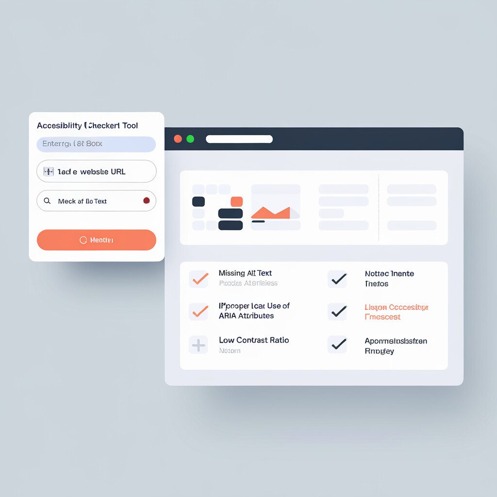
The holy grail of color contrast ratio, TheWai literally came up with a guideline (WCAG). The suggested ratio is 4.5:1 for normal text and 3:1 for large-size text. Now, you can utilize any online contrast checking tool (a complimentary assistant to TheWai) to inspect your color choices.
Don't withhold the boldness of a vibrant yellow. Harness the intensity of a deep purple. Yet always remember, much like our analogous pasta sauce, you do not want the spices to overpower the tartness of your tomatoes. Thus, salting your website with even measures of alternate text, ARIA, and equally vital contrast ratios is a classic recipe for fruitful web design boasting a heart of accessibility.
Isn't it time we boosted our websites' spice levels using these Accessible Web Tips, and cooked up a storm of users racing back for seconds?
Looking to enhance the accessibility of your website? This how-to guide targets web designers and developers, offering valuable tips to improve color contrast for better accessibility.
By following TheWai's guidelines for color contrast ratio, web creators can ensure text stands out against backgrounds, making content easier to read for all users. Utilizing contrast checking tools and balancing vibrant colors with accessibility features like alternate text and ARIA can elevate your website's design.
Incorporating these Accessible Web Tips, designers can create visually appealing and user-friendly websites, attracting users to navigate with ease and return for more engaging content.
Well, folks, we've journeyed through a vibrant landscape of accessible web tips, haven't we? We've illuminated the cavernous concepts of web accessibility and pointed our compass towards creating a more inclusive digital world. If 'contrast ratio' and 'alt text' seemed like alien glyphs at the start, we bet they now feel like your best allies in fostering an accessible web.
But hey, let's be honest. The journey to an inclusive web isn't a motley picnic. It calls for patience, practice and perseverance. It means weaving thoughtfulness into every strand of design. You'll face challenges, sure, but meanwhile, you're also building bridges for everyone to cross the digital divide with ease.
Just imagine this – each alt text you craft and every ARIA you implement could make someone's day easier. Every accessible PDF and improved contrast ratio can help make the web feel like home for someone who once felt left out. That's a serious win in our books!
This guide is a waypoint on your accessibility adventure, but don't stop here. Expand on your knowledge, delve deeper into WAI and WCAG guidelines, challenge the conventions, and make your corner of the web a beacon of inclusivity.
So what are you waiting for? Strap on your boots and venture forth. Start making your website shiny and accessible today! Remember, your actions will create ripple effects towards a more accessible digital world for us all. And in this journey, you're not alone. We're here, cheering you on!
So, ready to make a difference? Chin up, confidence high, and let's do this!