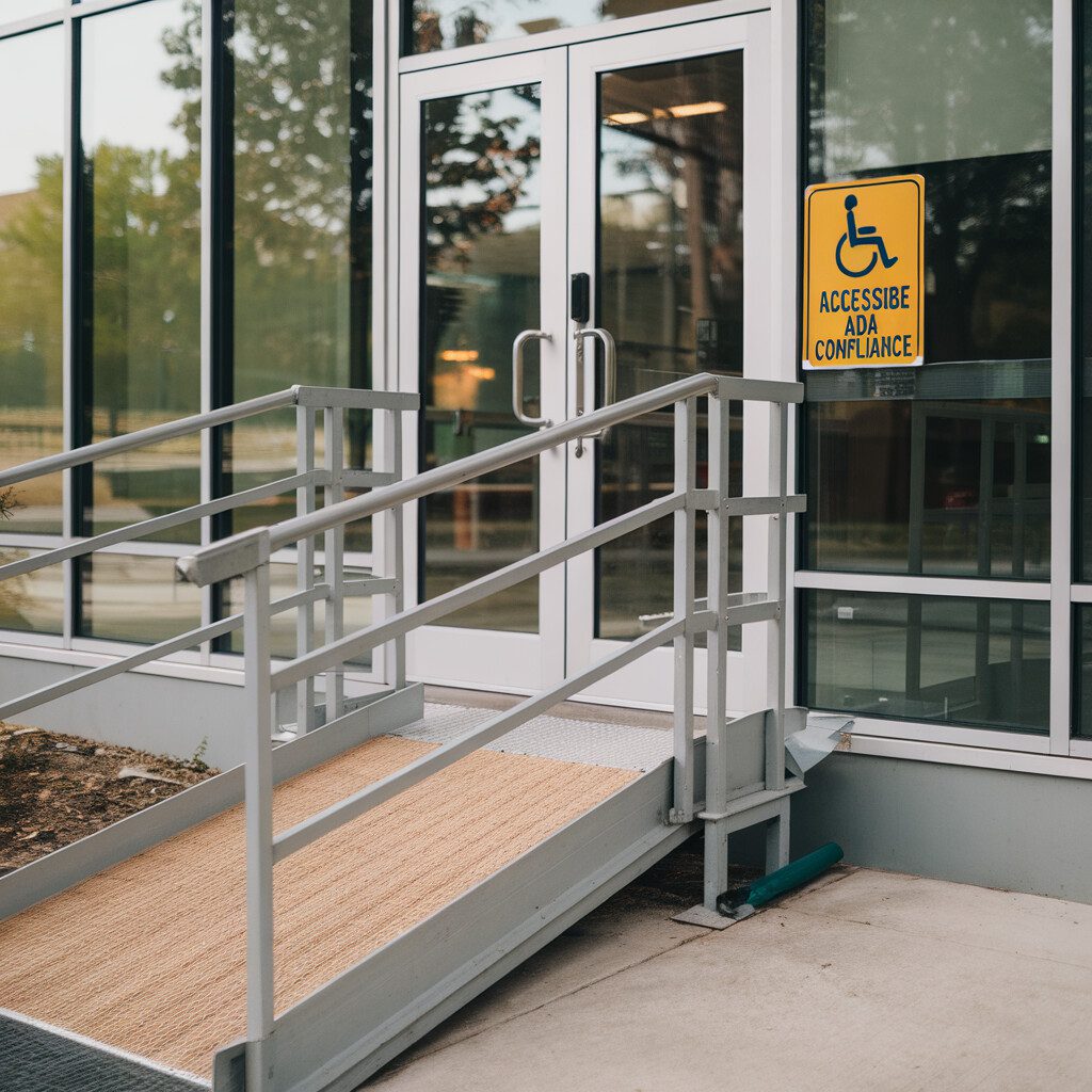
Ever walk into a party, only to find no one can understand you? Switch the DJ, cookies for cacti? Simply gut-wrenching, isn’t it? That’s how it feels to struggle with a website not designed with inclusivity in mind. It’s like speaking Martian in a rambunctious Mardi Gras. Confusing, frustrating, and decidedly unfun. And that’s why we’re here to jump into the twisty-turny world of “inclusive website design.” In the digital age, virtual spaces should be as welcoming as your favorite coffee shop. Yet, maneuvering the depths of this concept could be a bit like wrestling a hoverboard on a zipline. Believe it, we've been there. Fret not, dear adventurer. We’re about to embark on a journey that updates your tech vernacular, sprinkling in a good dose of practical applicability. Hold up, don't be ruffled by unfamiliar terms like accessibility, alt text, ARIA, or WCAG. We promise, they're less alien than they sound, a bit like calling an amiable martian Bob rather than Zorgon, the Unknowable. From designing for equal access to stirring the delicious soup of WAI in web accessibility, we’ll cover it in a cosy chat over an imaginary campfire. Through delightful anecdotes and everyday scenarios, we'll shine a light on the power of contrast ratios and take you through the art of creating accessible PDFs. It's as exciting as deciphering a secret language. And by the end, you'll not only understand, but you might just spot frustrations even before they pop up—an insightful guide like no other! So, why not put on your digital kicks, take a running jump, and join us in this intriguing labyrinth of inclusive web design? There’s a whole bunch of friendly martians (Read: tech insights) waiting. Let’s unravel them, one fun story at a time.
What is Inclusive Website Design?
Imagine this: You finally crack the riddle of your grandmother's treasured lasagna recipe. Your senses are awakened by the bubbling delicacy in the oven, and as the aroma swirls around you, you feel a tug of connection stirred by a simple culinary delight. Now, picture this. You wish to share this newfound joy with your best friend. However, your buddy is navigating the challenging waves of being visually impaired. How would you ensure they too can savor this experience? You wouldn't just read the recipe aloud, right? You would likely share tactile cues, explaining texture, or even walking them through it 'hands-on.' This anecdote encapsulates the heart of inclusive website design. Similar to how you'd make the journey of recreating Grandma’s famous lasagna just as joyful and convenient for your visually impaired friend, inclusive website design aims to offer equal access to information and functionality to all users. It’s the power tool that helps everyone, regardless of their ability, participate fully in the expanding digital universe. From using ARIA to add context to complex web elements, ensuring sufficiently large contrast ratios for better readability, making PDFs accessible with improved structure tags, to penning impactful alt texts for clearer image descriptions, true inclusion requires conscious effort. So, when we gently fold in the principles of device-independent user input, adaptability to user-preferred settings, guide assistance, and, most importantly, a pinch of perceptibility, that’s when our online lasagna turns out perfect. We're talking about the robust, mindful process of crafting every garage-sale-found antique or shimmering city skyline into a narrative that is as rich visually as it is textually. And by doing so, we're aiming for the equal usability gold, making sure web content is equally accessible whether a person drives through the technological autobahn using high-tech sports cars of screen readers and Brailles or heavy-goods vehicles of closed captions. In this kaleidoscope, also known as the digital frontier, we’re advancing our journey of building resilient, sustainable communities—just one inclusive website design away from a more equitable world. With the principles we're about to explore, your digital space could be that lifeline for someone traversing the often unwieldy footpaths of our vast digital world. Isn’t that thought just as inviting as the potential infinite clones of Grandma's lasagna? Onward, then! Let’s dive into a deeper exploration of inclusive website design.
The Impact of Accessibility on User Experience
Picture yourself at a tech-themed party. As you nibble on pizza and chug your soda, remote in one hand and mouse on the other, you're all set for an epic online journey. Everyone is assuring you that it's a quest worth taking—but just as you're ready to dive into this cyberspace adventure, you hit some accessibility hurdles. The language of the realm is puzzling, and the secrets of the landscape remain untold. Your world is suddenly full of barriers hindering your experience—sounds familiar, folks? This nerve-wracking moment, frustrating and disappointing, mirrors the digital experiences many face daily due to less-than-impeccable website accessibility. A downside to the technology tale, right? Hang in tight, we're on a mission to rewrite this story, championing more inclusive website design. So how does accessibility impact user experience, you ask? To draw a quick analogy, think of a website being like the swanky glitzy party—delicious content for all to savor, interactive features that spark vivacious conversations, stunning visuals stirring wide-eyed admiration. However, if the party is so happening that it excludes incapable, differently-abled, or elderly attendees because there aren't suitable arrangements or facilities, that's where things flop. Websites, just as events, ought to cater to everyone, regardless of ability. When the narrative is inclusive, everyone gets to join the party! An inclusive website design, knitting in accessibility tools like Alt Text for images, ARIA landmarks for better navigation, improving contrast ratios for readability, or creating accessible PDFs that work with assistive technologies, enhances user experience dramatically. It extends the exciting aspects of the internet to every single user, opening the door to communities previously sidelined. There's no denying—inclusivity indeed breeds innovation! Most importantly, when it comes to usability—we’re taking off the armour, kicking up our feet, and making navigation a cakewalk. The heroes of our tale are our users and we aspire to turn their medial quests into legendary ones. Accessibility is the magical portal leading us toward that reality where all users immerse themselves in the same enriched adventures, driving our noble ambition of community-building and making technology an equal opportunity player. Oh, the happy ending we all pine for. Let's make that aspiration into an accomplishment, shall we?
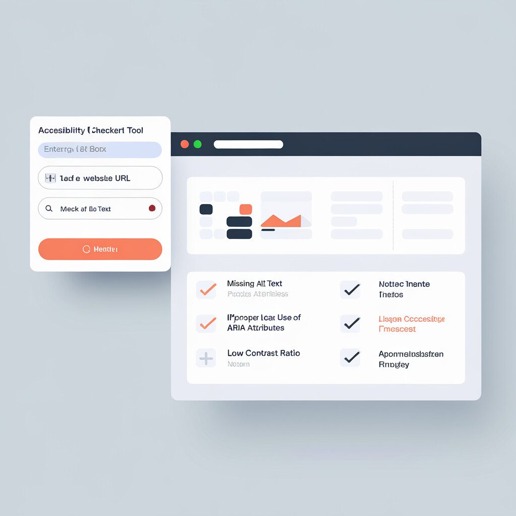
Navigating the World of Alt Text and ARIA
Swinging the doors open to our progressive adventure of creating inclusive website design, it's now time to swirl into the enchanting labyrinth of Alt Text and ARIA. Seems a bit intimidating, eh? Worry not! We're here to dive into its magic, hand in hand, so allay any fears you may be clutching onto. Imagine strolling through a picturesque art gallery, only to realize you're without your glasses. Frustrating as it is, all the beauty and detail in the artwork is indecipherable to you. Alt Text is just like that kind-hearted friend who lends you their glasses. Its mission? To ensure every little trinket of detail is noticeable to anyone who struggles to visually comprehend a website's images. A matter of pixels becomes a storytelling scene with Alt Text’s superpower of inclusivity. Next stop, our uncrowned hero, ARIA, standing tall in the elusive shadows of our journey. Think of ARIA as the comforting voice that guides blindfolded participants in trust walks. ARIA labels and roles assist screen reader users to comprehend website content, to move seamlessly around interactive elements like buttons or sliders, demystifying the unknown territories. Nurturing an inclusive website design wouldn’t catch flight without these two invaluable elements. So, while developing your digital scenery, remember to engineer your platform for inclusivity. It’s like planning a party—put out the effort to ensure every guest, regardless of their abilities, fosters a sense of belonging and can rave about having a splendid time. Up next in our trip to Wonderland, we're set to unravel equally mystical matters. Onward, shall we, to contrast ratios and accessible PDFs? Join the merry band and let's continue making digital magic accessible for all.
Creating Accessible PDFs: A Step-by-Step Guide
Moving forward in our tale of making the digital world more inclusive, remember when we laughed about the struggle of assembling that jigsaw puzzle in a hushed, candlelit room? Idly assigning an alt-text solution to a complex design can be akin to that – messy and frustrating. Picture this: a person visually impaired, trying to fit your poorly labeled jigsaw pieces in the gloomy surrounding, anxious and marginally succeeding. Sounds grim, right? The good news is that by creating more accessible PDFs in our inclusive website designs, we can ignite a thousand tiny sunbeam-like experiences for our users. Sort of like turning on a bright overhead lamp in a room full of potential jigsaw champs. And who wouldn't want to be a beacon of hope in someone's world? Let’s flick the switch, shall we? Roll up your sleeves, friend, and help your users navigate with alternative text that clarifies image context, just like a cheery guide at a bustling museum. Ensure any barriers are bulldozed instantly for easy access, similar to when rich carpets are laid down for royal visitors. But wait, it doesn't stop at grand entrances! Infuse the heart of your PDF content with ARIA landmarks to create structure, remember it's never about less information, but rather readily available info for all! Like arranging signs during treasure hunts, follow accessibility guidelines within your web design, and your users will always find their booty of information, regardless of the foggy weather outside. Lastly, here's a pro tip, friend! Don't ignore the importance of contrast ratios – they're the spices in the alphabet soup of accessibility. Just like culinary recipes call for the right balance of seasoning, your PDF accessibility initiatives warrant a satisfying sensory blend of visual comfort. It's about crafting accessible PDFs neatly stitched together with threads of inclusivity; an exclusive chapter in our expansive narrative of inclusive website design. It's a journey that not only champions equal access but helps bind our whole village, or let’s say, our collective online community tighter. So, are you ready to lift the lamp higher and light a path for all? Because in this community-driven world of ours, no teammate gets left behind in the dark. Let's march towards a future where every PDF is an open door and every user finds their way home.
Designing for Equal Access: Tips and Best Practices
Carrying the lessons we've learned so far, let's dive into the bubbling wellspring of design – designing for equal access. Inclusive website design, my friend, is like preparing a feast for an international gathering. It's about ensuring every dish on the table entices folks from all corners of the globe, while also catering to different dietary needs and preferences. Imagine for a second, your website is a grand banquet where the visitors are your honored guests. Someone is vegan, someone peering at menu card wears eyeglasses, or a guest from the Arctic has never had tropical fruits. Wouldn't it be splendid if your website could take a bow graciously, flex its code, and change forms to accommodate varying needs? Isn't that the heart of the fascinating realm of inclusive website design – it’s like the spell of a shape-shifter altering forms to embrace all. By enhancing usability with clear contrasts, easily navigable structure, ARIA landmarks, and accessible PDFs, you ensure everyone at this metaphorical banquet finds a plate filled with delightful information they can comfortably consume. Now picture alt text like invisible wizard interpreters, weaving a sensory realm for visually impaired visitors. Alt texts deliciously describe emojis, images, and memes, ensuring your guests can chortle, contemplate and contribute to your feast of content exchange. Don't abandon the journey here though. Go beyond and experiment with WAI and WCAG standards, leaving trails adorned with peas of contrast ratio, breadcrumbs of readable fonts, and appetizing ARIA safe havens. This welcoming gesture can help turn those once daunted by the dense forest of web accessibility into brand ambassadors for your digital territory—increasing that scrumptious website traffic you've been craving. While we can't wave a magic wand to bulldoze these challenges, taking this all-inclusive path can foster a community built on equality and mutual respect. So forge ahead with the spirit of adventure, and house all visitors in the warm, welcoming hearth of your site. After all, variability is fundamental to being human. Embrace it, champion it, don't just cater to it.
Understanding WCAG Guidelines for Inclusive Web Design
Navigating the vast ocean of WCAG guidelines might seem like a labyrinthine voyage, doesn't it? But let's turn that trip into a treasure hunt, with the ultimate prize being an immaculate masterpiece of inclusive website design. Let me walk you through this adventure and change the view of ongoing challenges we meet on the way. Picture the WCAG guidelines as the compass guiding us through this digital terrain. Its cardinal points? Perceivable, Operable, Understandable, and Robust – abbreviatively known as POUR. These are our pillars of truly inclusive and accessible websites. First, imagine being trapped in a storm with waves roaring around you; it's terrifying, right? This storm represents users struggling with accessibility or usability issues in everyday web browsing. Now, design itself comes as the hero of our story, casting a beaming lighthouse of 'Perceptibility', slicing through the storm's gloom. Boom! Display colors suddenly have a perfect contrast ratio, and oh, look, alternative texts (Alt Texts) are breathing life into images for our visual-impaired friends! Next, navigating the seas of 'Operability' we hoist our sails, adjusting with ARIA attributes, making every website interaction smooth sailing. It's no longer a chaos of untouched buttons; it dances and harmonizes at every user's command—equivalent to a symphony being played under the star-lit sky. Undeniably magical! Then we journey into the world of 'Understandability' where clarity reigns, removing any trace of fog that could potentially steer our users off the path. Our final destination? The robust fortress of 'Robustness'. Here we integrate our website's structure to be sturdy and reliable, delivering an uninterrupted user experience. Now, accessible PDFs, equal access, and WAI begin their harmonious dance, reinforced by the rhythm of our inclusive website's heartbeat. This adventurous journey across WCAG guidelines should evoke more empathy in us. Let's remember that our ultimate aim is to build a community, an inclusive digital haven, accessible to all.
Exploring the Role of WAI in Web Accessibility
Picture this – you’re assembling your dream treehouse. Like an inclusive website design, every component – the ladder, the windows, even the secret trapdoor – needs to be accessible to everyone who wants to explore it, right? Enter WAI, our architect friend equipped with a magic blueprint: Web Content Accessibility Guidelines (WCAG). WAI, courtesy of the World Wide Web Consortium (W3C), is our Percy Jackson in the quest for web accessibility, providing valuable guidance and recommendations. It stands as a beacon in the web's complex labyrinth by equipping us with tools such as WCAG. Weaved into the very DNA of these guidelines is the ethos of inclusive website design, turning extensive virtual landscapes into inviting, accessible experiences. Let's imagine we’re hoisting a ladder, ensuring it’s firm, and has sturdy rungs. WCAG performs a similar role. WAI recommends arranging information coherently and using alternative text descriptions – essentially prioritizing the user's seamless interaction. However, the architect’s blueprint doesn’t stop there; it also necessitates an optimal contrast ratio between text and background, ensuring everyone can read the rule book etched onto your tree-house. Likewise, an inclusive web design would involve ensuring ‘Accessible Rich Internet Applications' (ARIA) are smooth, and PDF's are fully reachable. Navigating unchartered territories gets challenging. Although building for an all-embracing web community can seem like an Everest climb, the march towards web accessibility is made smoother with detailed guidelines from WAI. So, ready to don your hard hat and design a digital environment for one and all? Turns out climbing Everest just got a little more manageable. The WAI signage will be your guide, leading the way through accessibility mazes – transforming the mighty peaks into welcoming rest houses one by one.
The Power of Contrast Ratio in Inclusive Design
Continuing our journey of accessibility and inclusivity, let’s plunge into the compelling realm of contrast ratios. This isn't just some technical buzzphrase in the inclusive website design world—it's nearly as crucial as an oxygen mask in a spaceship! Imagine you're at a mystery movie marathon in a darkened theatre, straining to make out crucial details. Who's the rogue character lurking in the shadows? The stress piled up despite the abundance of popcorn, didn't it? That's what a poor contrast ratio feels like in digital design—it makes your website indecipherable for many, quite a roadblock in accessibility land. Now, you see, in the world of inclusive website design, we're all about smoothing these paths. So, we wield the power of contrast ratio. It's like adjusting the brightness on your TV, allowing every character, no matter how shadowy, to be seen clearly. You've eliminated guesswork, and your audience can enjoy the narrative without feeling left in the dark. Why is this so important? Well, mate, put on the shoes of folks with low vision or color deficiency. For them, deciphering poorly contrasted websites can be as tricky as solving a Rubik's cube blindfolded. A robust contrast ratio, though, turns that tricky Rubik's cube into a welcoming open door. It ensures that everyone, regardless of their vision capabilities, can navigate with ease and feel a sense of belonging. Together, driving down the highway of inclusivity, acknowledging the power of contrast ratio reiterates our commitment to community building. The best inclusive website design creates a digital globe where everyone coexists in harmony—a world free from the stressful mystery marathons. Remember, in our cosmos of accessibility, we leave no man behind.
Conclusion
And off we go, my friend—you're now armed with your explorer's kit for the wild frontier of inclusive website design. As we stand together on the mountain peak, looking back at the journey we've just traversed—right from the early footfalls on the landscape of accessibility, through the dense jungles of alt text and ARIA, to the peaks of WCAG and WAI—we can agree that it's been quite the adventure, hasn't it? You're no longer scrambling about in the murky mysteries of contrast ratios and accessible PDFs. Instead, you stand tall, a trailblazer ready to blaze your own path through the internet wilderness. We've shared laughs, gasps, and the thrill of those visceral "Aha!" moments. We've transformed your viewpoint—not only about the importance of accessibility but also about the magic it coaxes into our lives and communities. With this newfound knowledge, you're no longer just a visitor in this strange terrain. You're the pioneer—a mender of gaps and the whisperer of inclusive codes. Stuff that flag of usability and equal access deep into the soil—it's your turn to leave an indelible mark on the world of technology. Why not venture out into the expansive realms of website building now? Construct tested, solid bridges over the treacherous crevices of usability issues. Become the compass guiding others through the wilderness, making complex navigation simple and welcoming all travelers, regardless of their abilities. I urge you now—unleash this transformative recipe into your world of web design. With a head full of insights and a backpack bursting with tactics and tips–you're all set to introduce a new era of digital inclusivity. So, my friend, why don’t you lace up your shoes, take a deep breath, and… start! Remember – every button you tweak, every alt text you patch, you shape a better, equal-access digital world—one where no one is left behind. Remember how far you’ve come—you’ve got this! So go on. Start today—dive in, sail into the uncharted waters, make your every byte matter. Boldly go into the heart of inclusive website design. Roll up your sleeves and make it happen—it's your time to shine!
FAQ:
What does ‘inclusive website design’ refer to?
Inclusive website design is about creating web content that is accessible and usable by all people, regardless of their abilities or disabilities. This includes individuals with visual or hearing impairments, physical disabilities, or those with cognitive or neurological disorders. An inclusive website ensures everyone can understand, navigate, and interact with the web effectively.
Why is accessibility important in user experience?
Accessibility is not just about compliance; it’s a crucial element that impacts user experience significantly. When a website is accessible, it caters to the diverse needs of all types of users, thus providing a satisfying browsing experience. It makes the website easy to comprehend, navigate, and interact with, irrespective of any physical or cognitive limitations.
What is the role of alt text and ARIA in inclusive web design?
Alt text and ARIA tags play a critical role in making a website inclusive. Alt text enables screen readers to describe images, enhancing web accessibility for visually impaired users. ARIA, on the other hand, provides more context to assistive technologies about the behaviors and properties of web components, enhancing interactivity for users with disabilities.
How does the contrast ratio contribute to inclusive web design?
A good contrast ratio ensures the clear visibility of text and images on a website, making it more readable and easier to comprehend. Thus, the application of an appropriate contrast ratio is vital for users with visual impairments, color blindness, or age-related vision loss. A contrast ratio guideline of at least 4.5:1 is recommended for normal text.
Can you explain what WCAG and WAI are?
The Web Content Accessibility Guidelines (WCAG) are a set of guidelines providing strategies for making web content more accessible. They are universally followed to ensure websites are inclusive. Meanwhile, the Web Accessibility Initiative (WAI) is a project by the World Wide Web Consortium that works to develop strategies, guidelines, and resources to make the web accessible to people with disabilities.